Environmental graphic design and illustration for Cebu Pacific headquarters.
Cebu Pacific Airlines is the leading budget carrier in the Philippines. In 2014, they erected a new corporate headquarters. Studio Dialogo created the various graphical elements that went into the building, from murals, cafeteria graphics, wayfinding, maps, and meeting room graphics. We worked in conjunction with the building’s architect to seamless integrate the various design elements with the building’s overall structure.
The Mission Vision wall has the biggest mural in the building, aptly facing the flight attendants' lounge to greet them as they come and go. Different landmarks and cultural elements from Cebu Pacific's destinations make up the artwork.
The mural is illustrated by Dialogo, and hand-painted by Alfred Vargas and team.
custom glass decals for different rooms
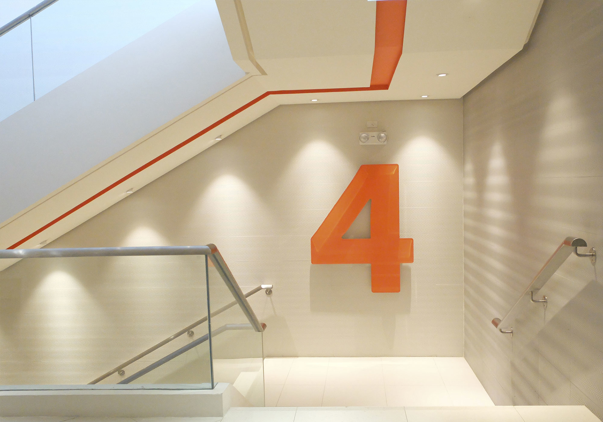
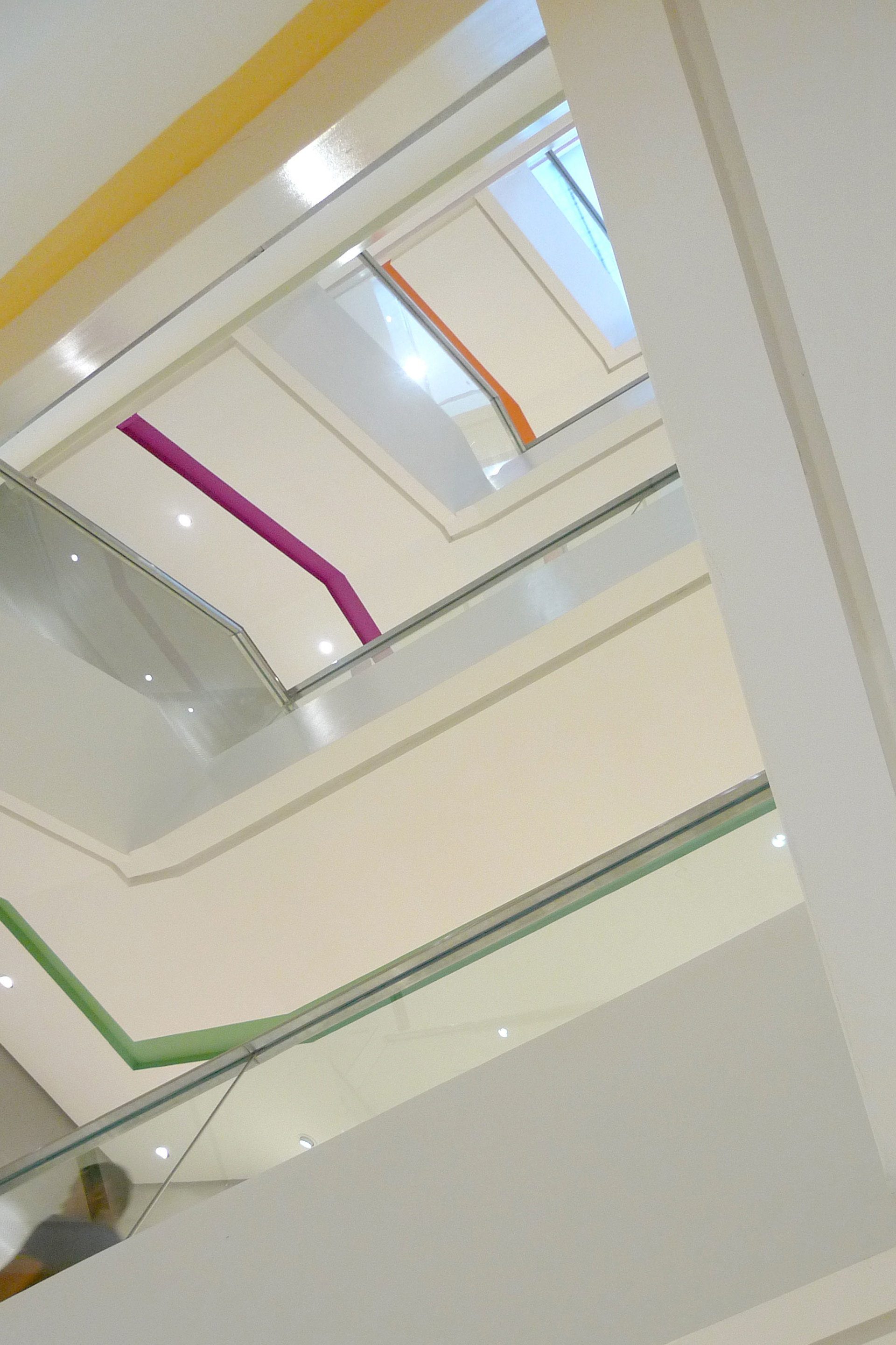
Each floor is distinguishable by a different color. The underside of the staircase is marked with these different colors, making the floors easy to identify from the ground floor. Each floor landing also has a big number marker.
The fun and casual atmosphere carries on in the fourth floor boardroom. Whereas most big organizations have state of the art technology, Cebu Pacific goes the other way and plays on the room’s title. Boardroom translates into a room that houses possibly the country’s biggest board game—a 24-seater conference table is decked with an actual board game based on Cebu Pacific’s many local and international destinations. Designed by agency Studio Dialogo, the graphics inspire other colorful embellishments in the room—giant dice and multi-colored tokens scattered through the entire stretch of the table.
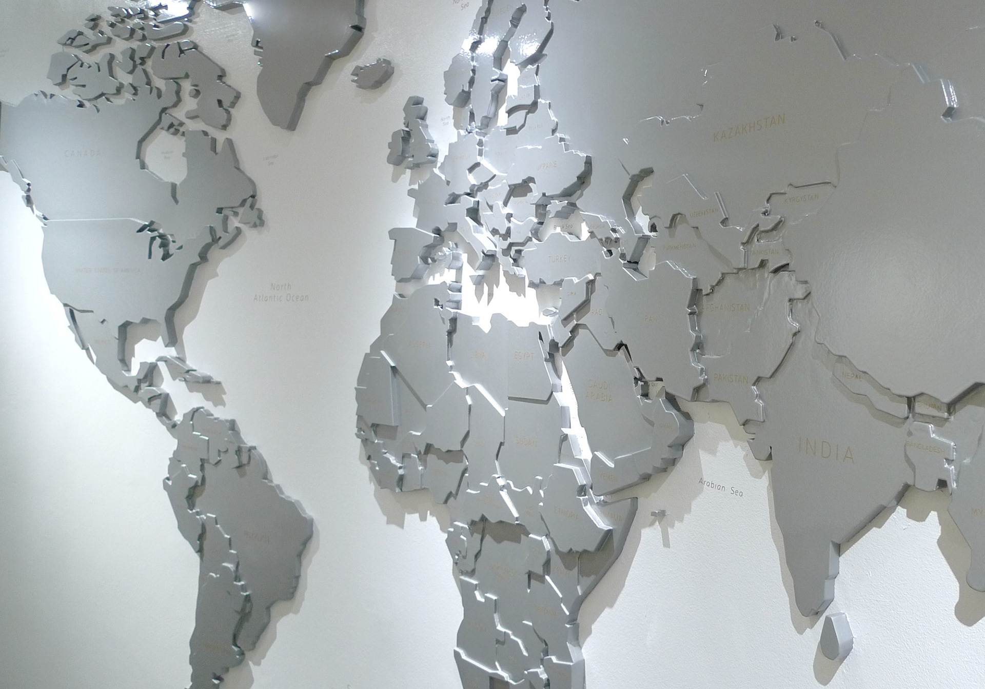
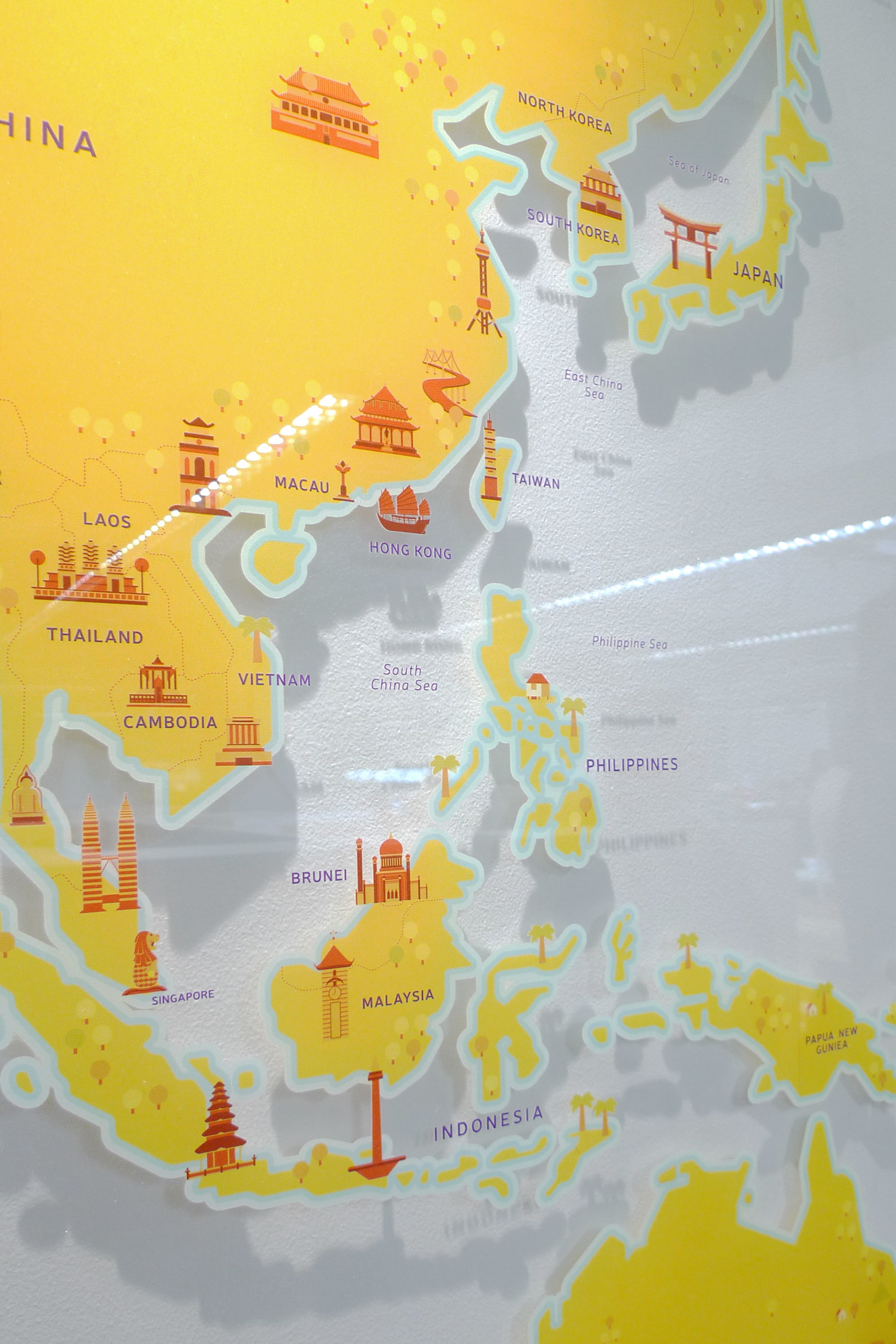
Several maps were made to suit the needs of different areas of the building.
A build-up neutral colored map on the fourth floor sets the sophisticated and formal tone fit for the nearby top management offices. A more colorful and illustrated map printed on glass is in the Marketing office area, which can be written on with markers during meetings.
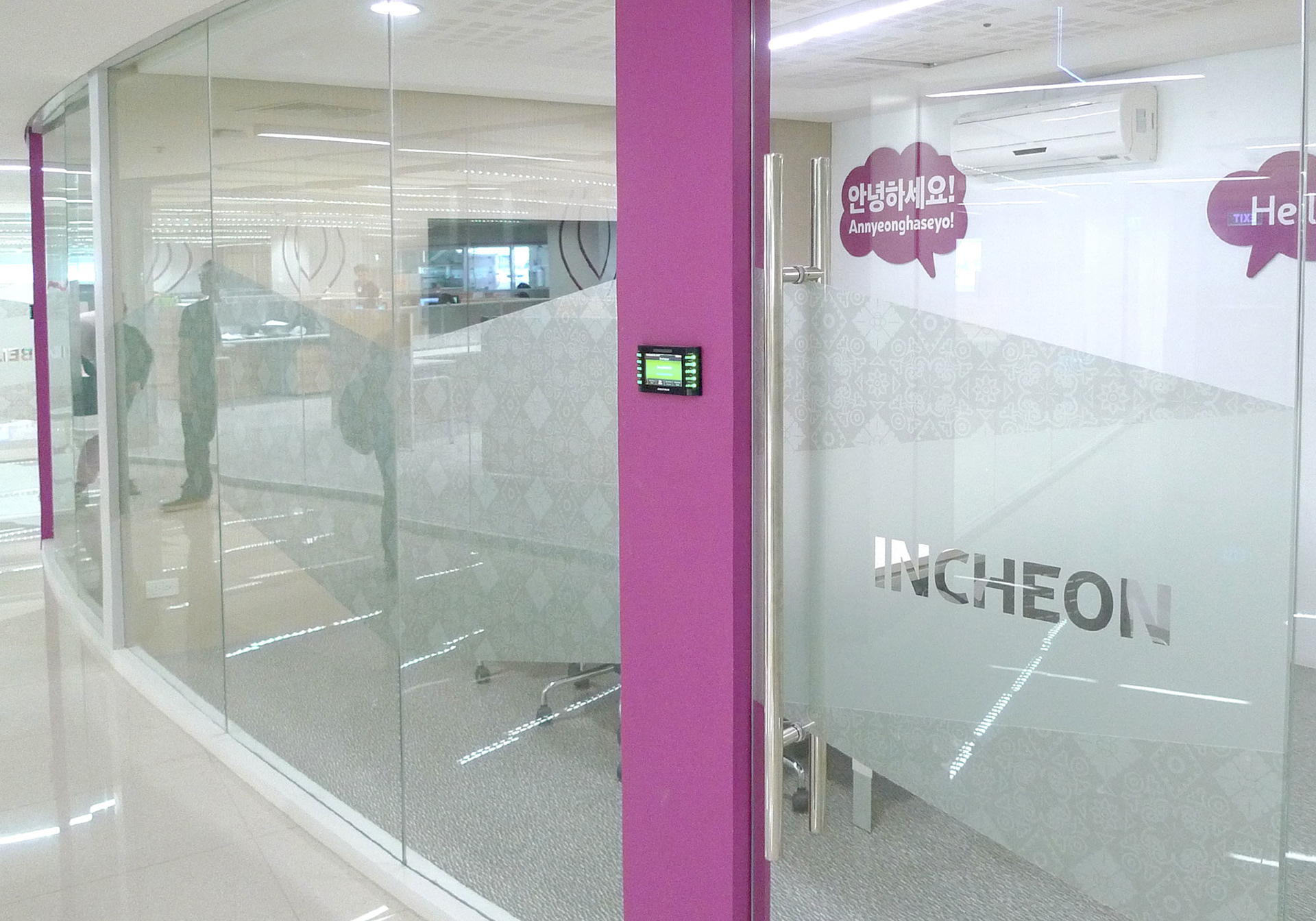
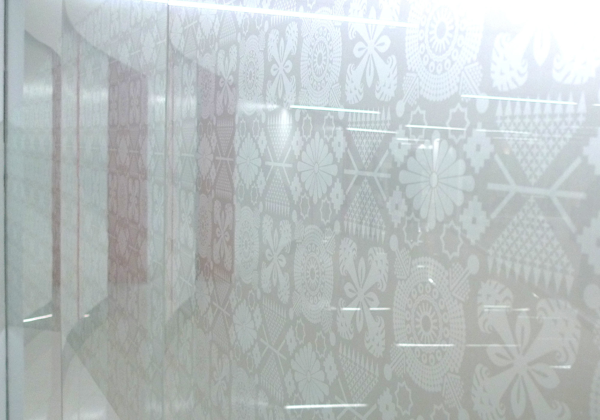
Meetings rooms are color coded according to floor. Decals on the windows and doors feature custom patterns made out of elements from the different countries per floor.
Each meeting room is named after a Cebu Pacific destination, and talk balloons inside show a greeting in English and in the language of the country the room is named after.
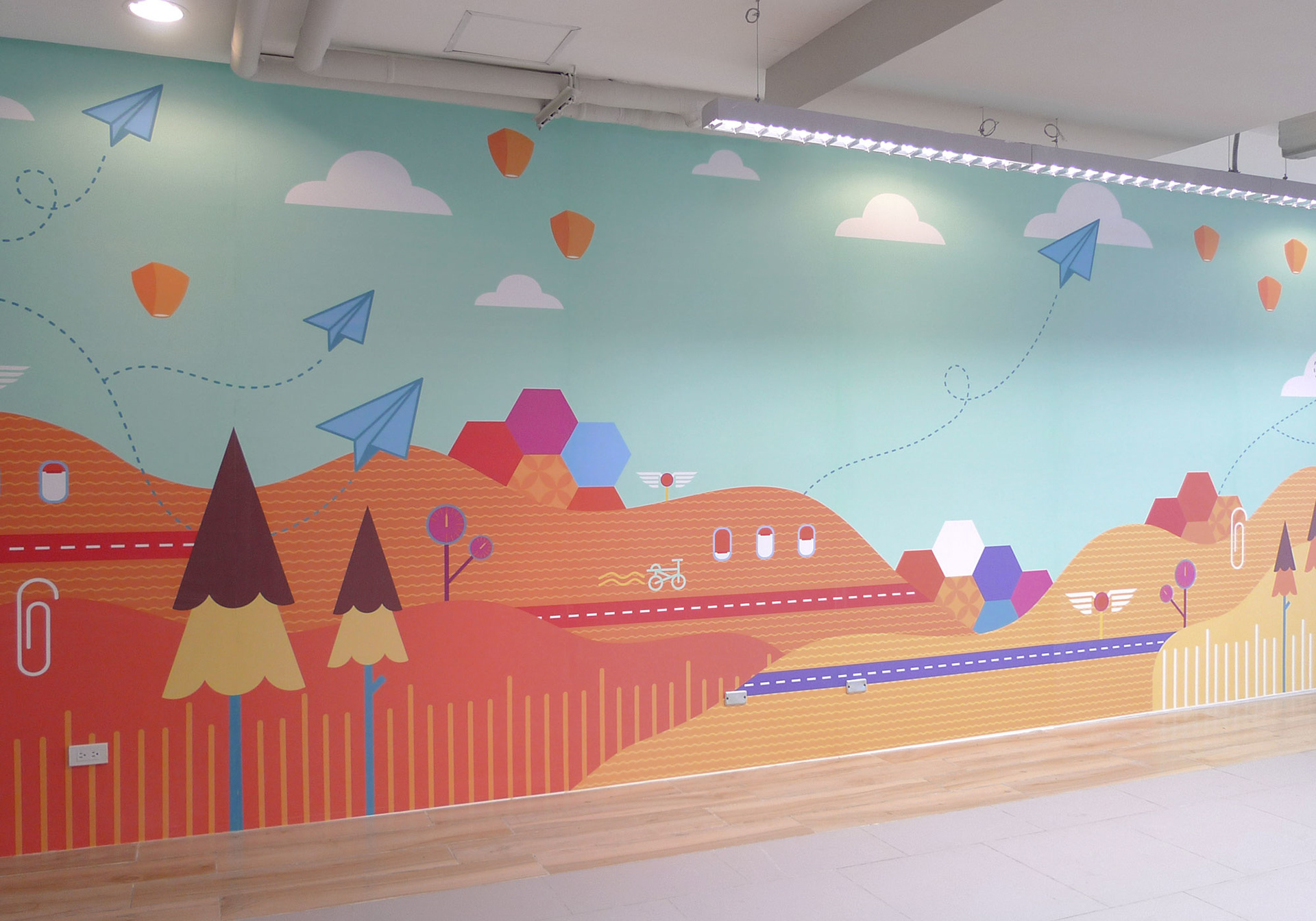
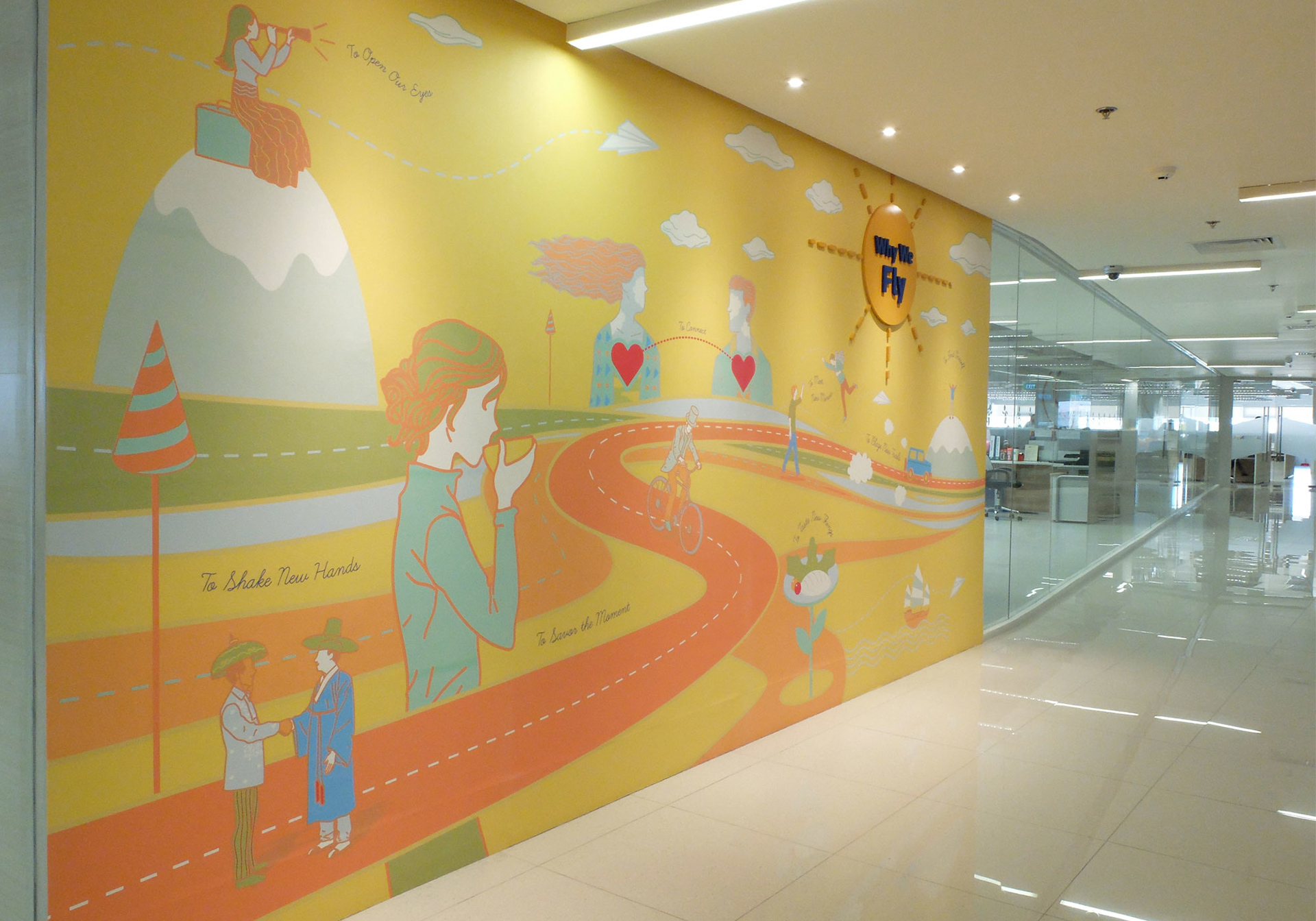
Murals are scattered all over the office space, bringing in the signature yellow that people have come to associate immediately with the brand. One of the most pertinent messages is “Why We Fly,” found on the fourth floor office area. The youthful approach to travel is captured in the Studio Dialogo-designed mural, which highlights the meeting of minds, tasting new things, blazing trails, finding oneself, opening one’s eyes, shaking new hands, savoring moments and connection.
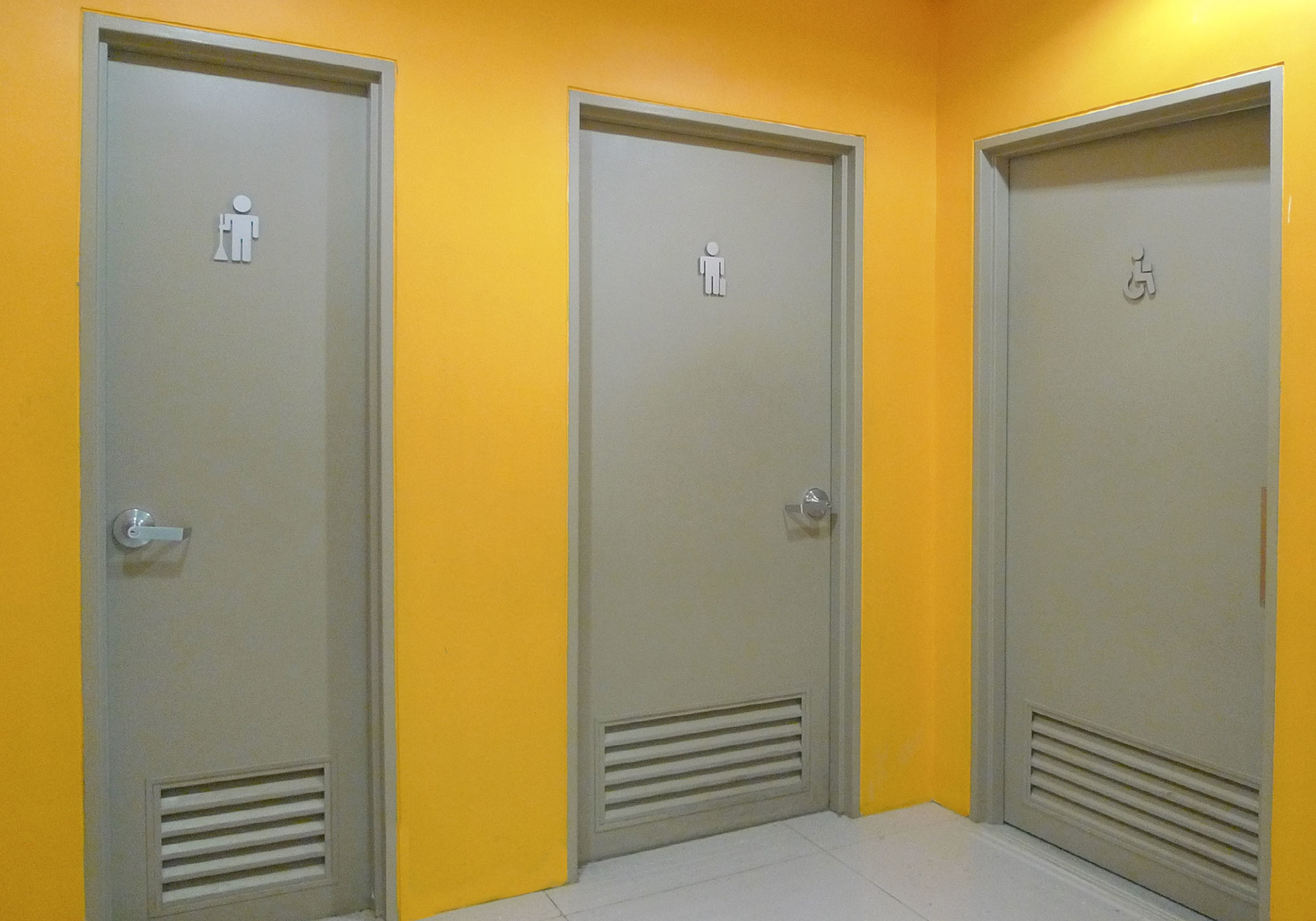
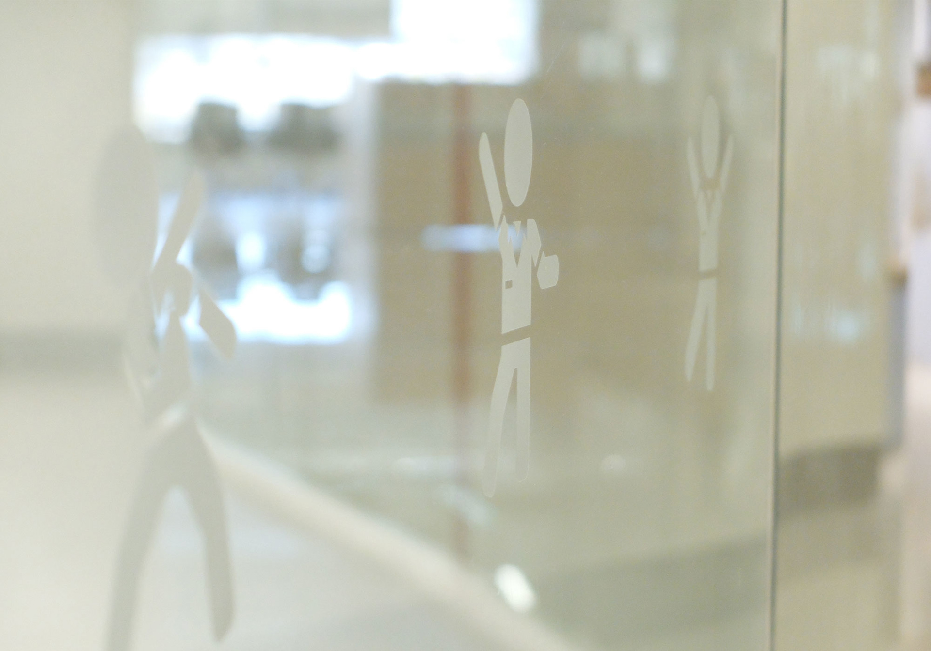
Custom icons on glass decals and comfort room door signages feature different ceb employee activities and passengers.
MURAL AND INSTALLATION ART FOR THE CAFETERIA
Cebu Pacific’s new office is a testament to the brand’s growth—from a small carrier to one of the busiest services in the country. It’s refreshing to see, however, that despite the airline’s fast rise, its spaces still live and breathe the culture of fun, innovation, and entrepreneurship it has cultivated from its humble beginnings.
