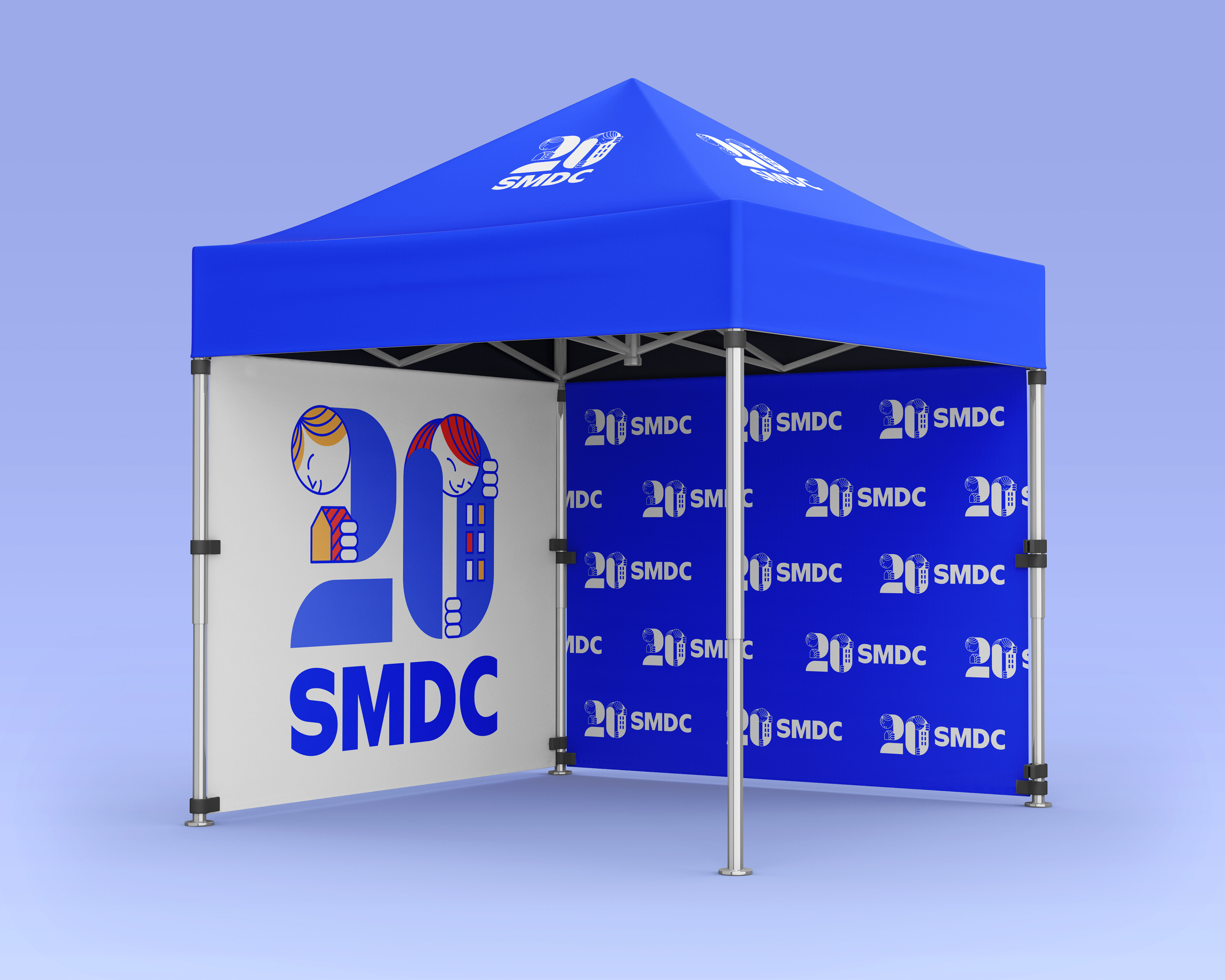
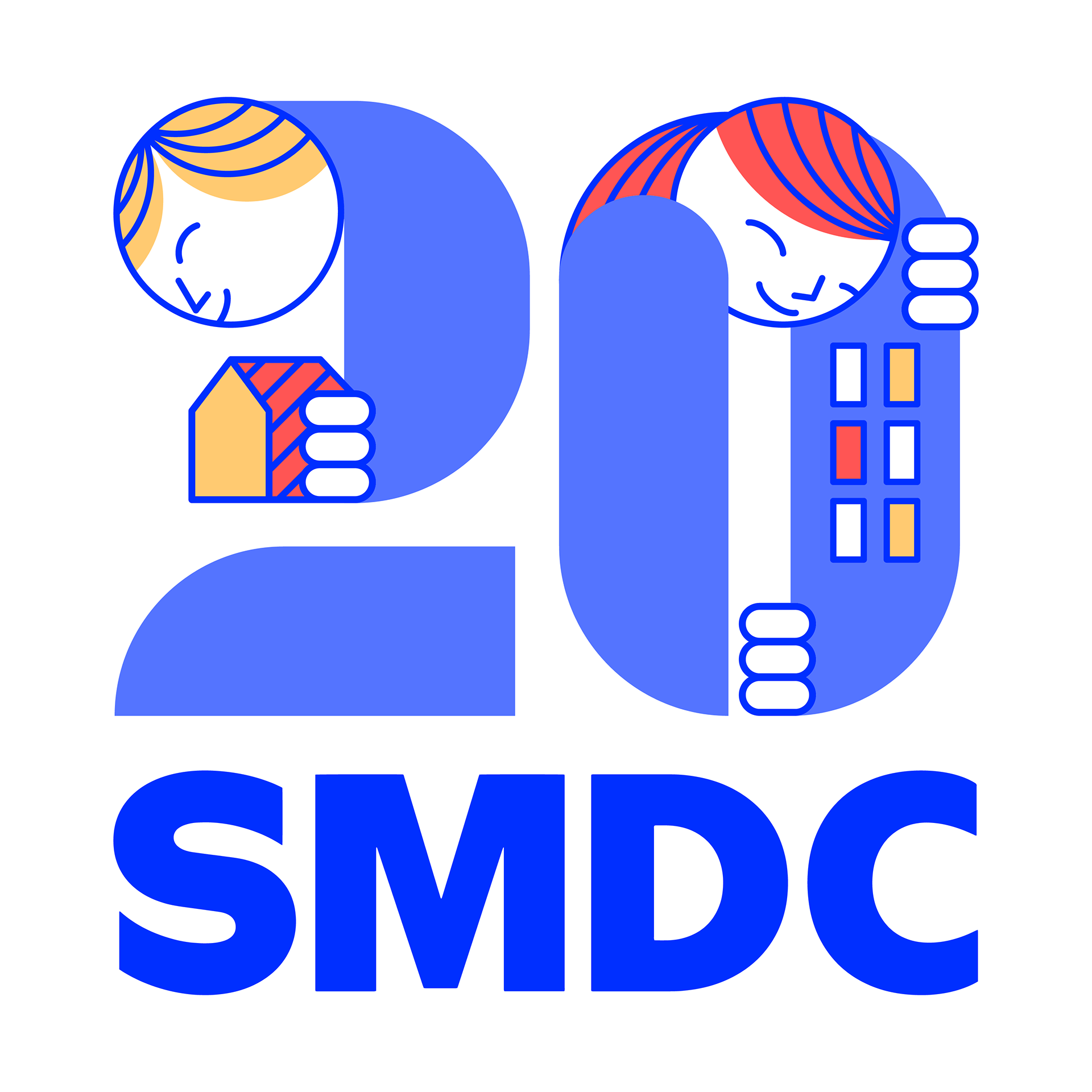
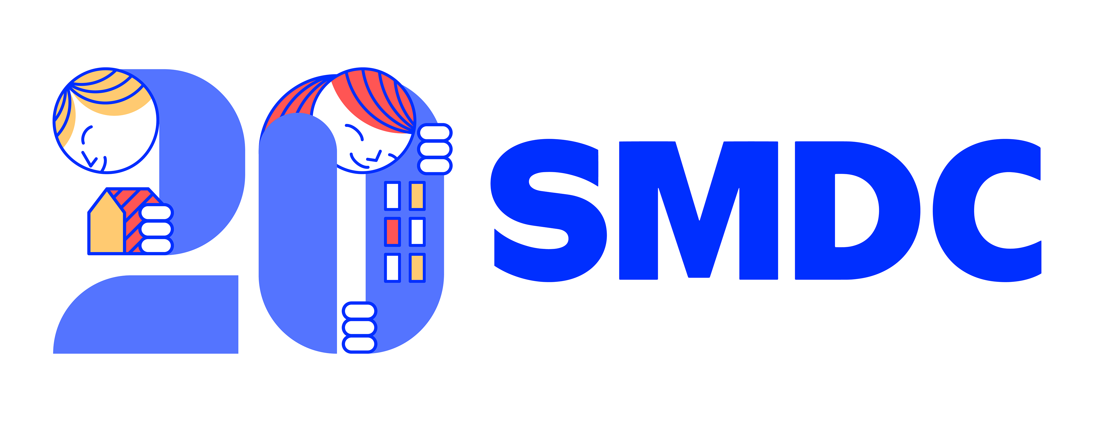
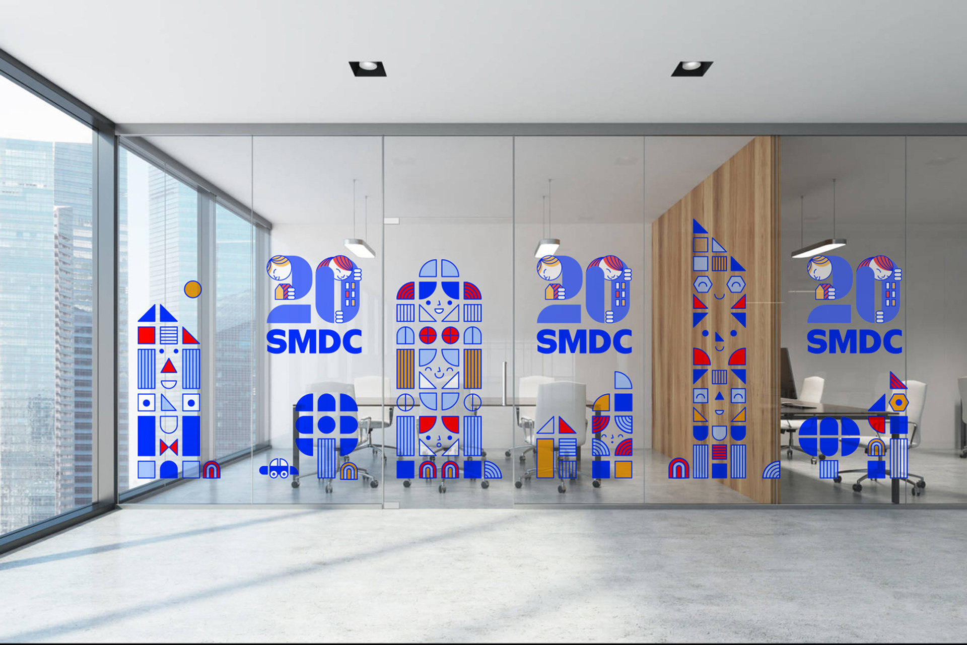
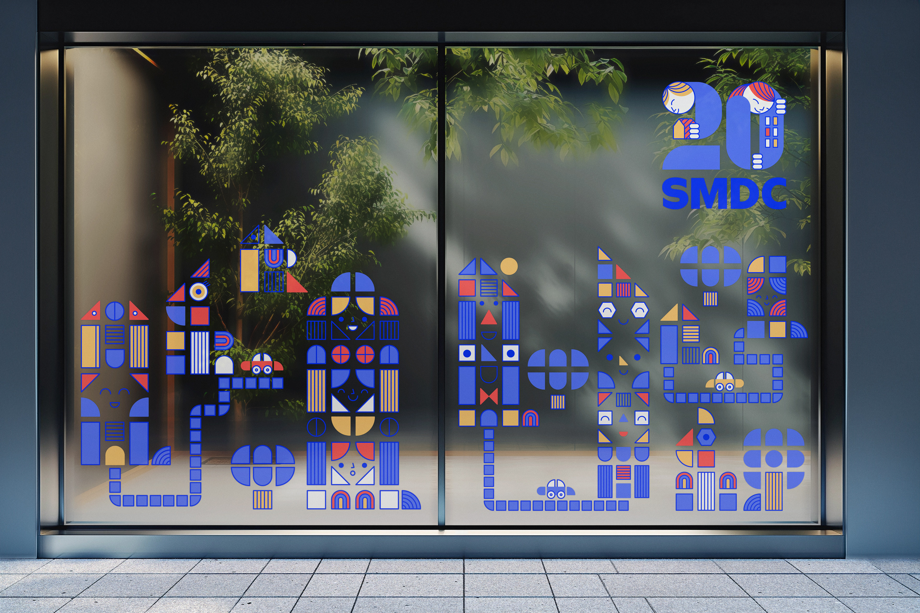
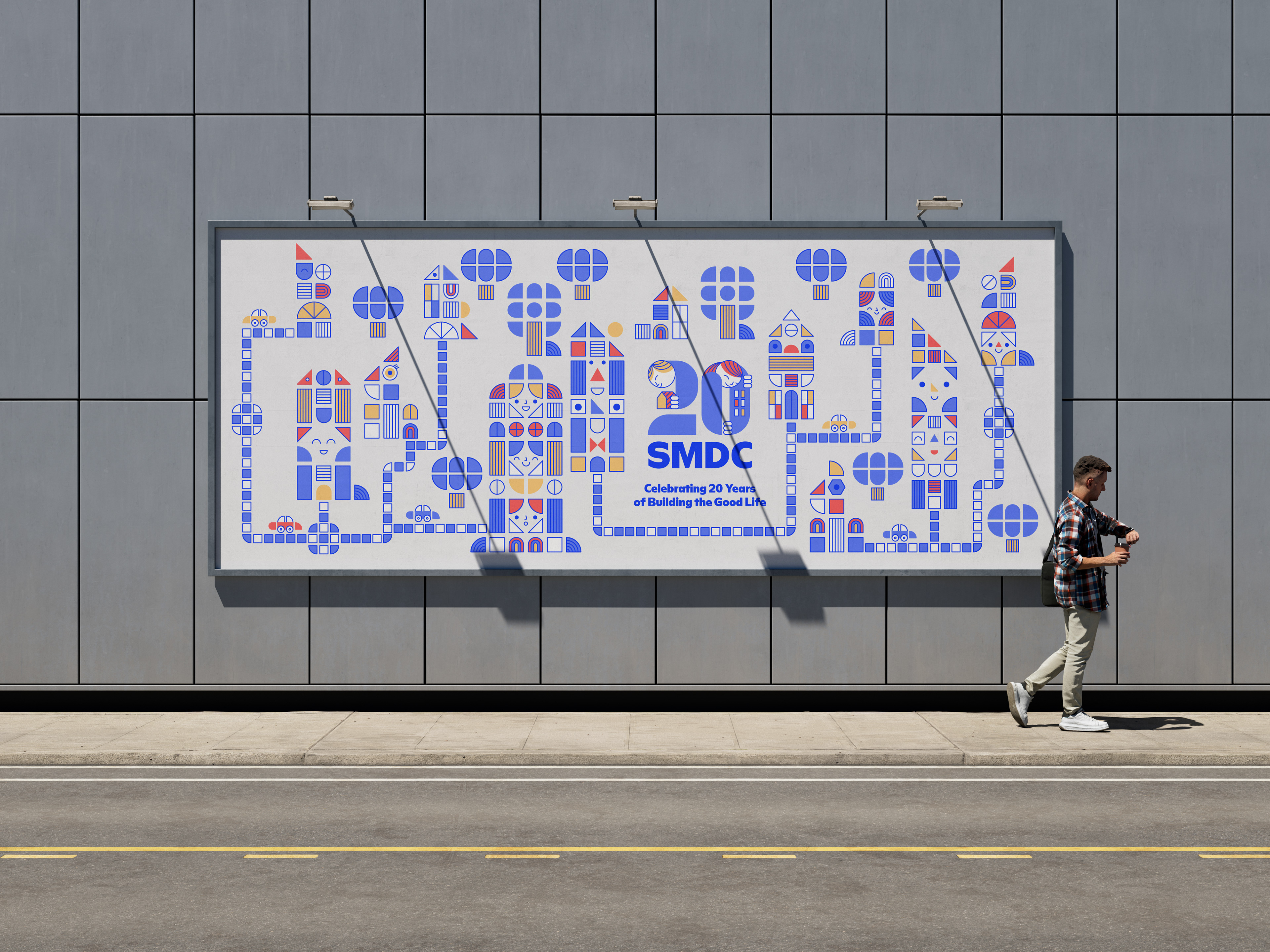
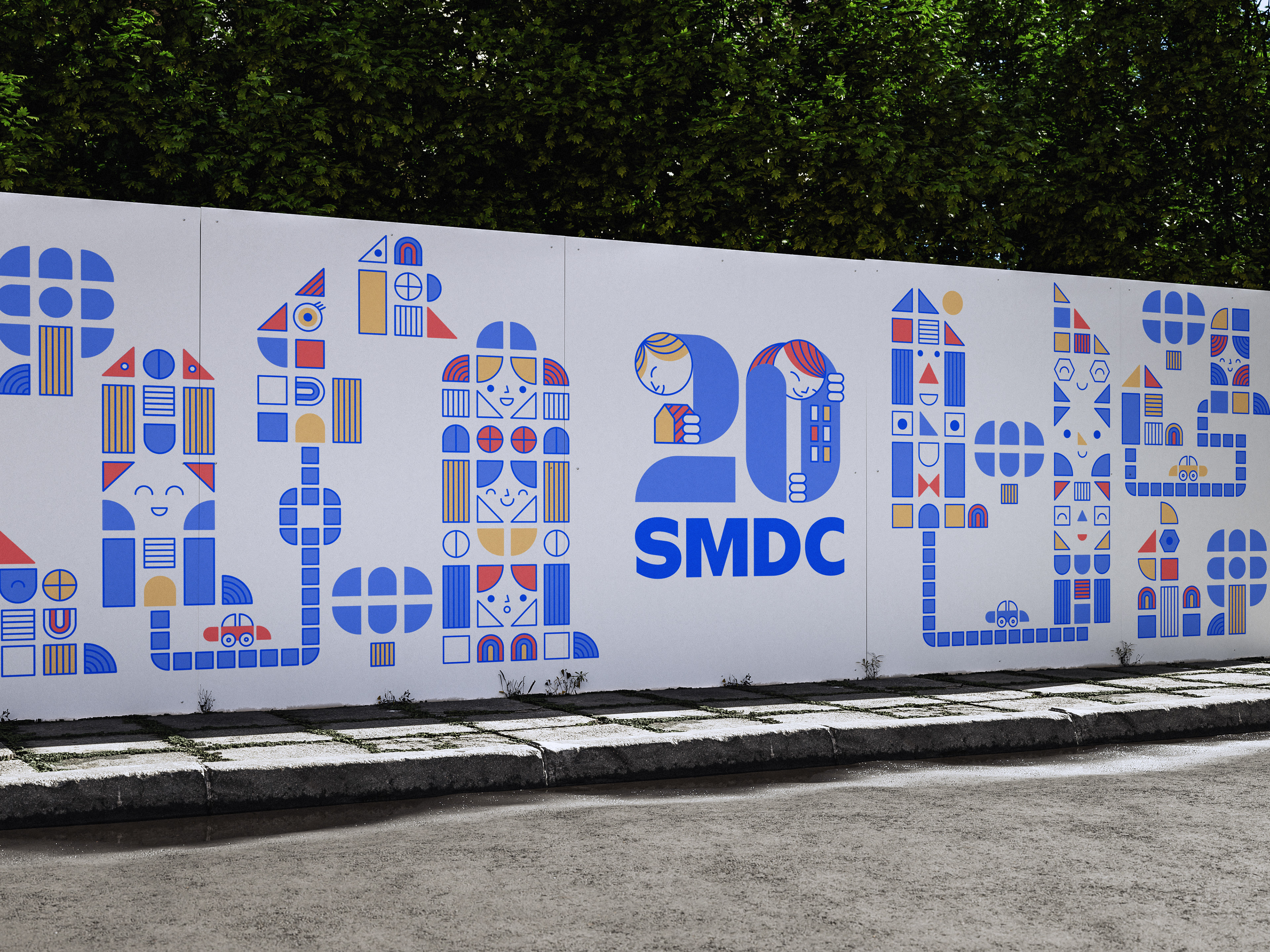
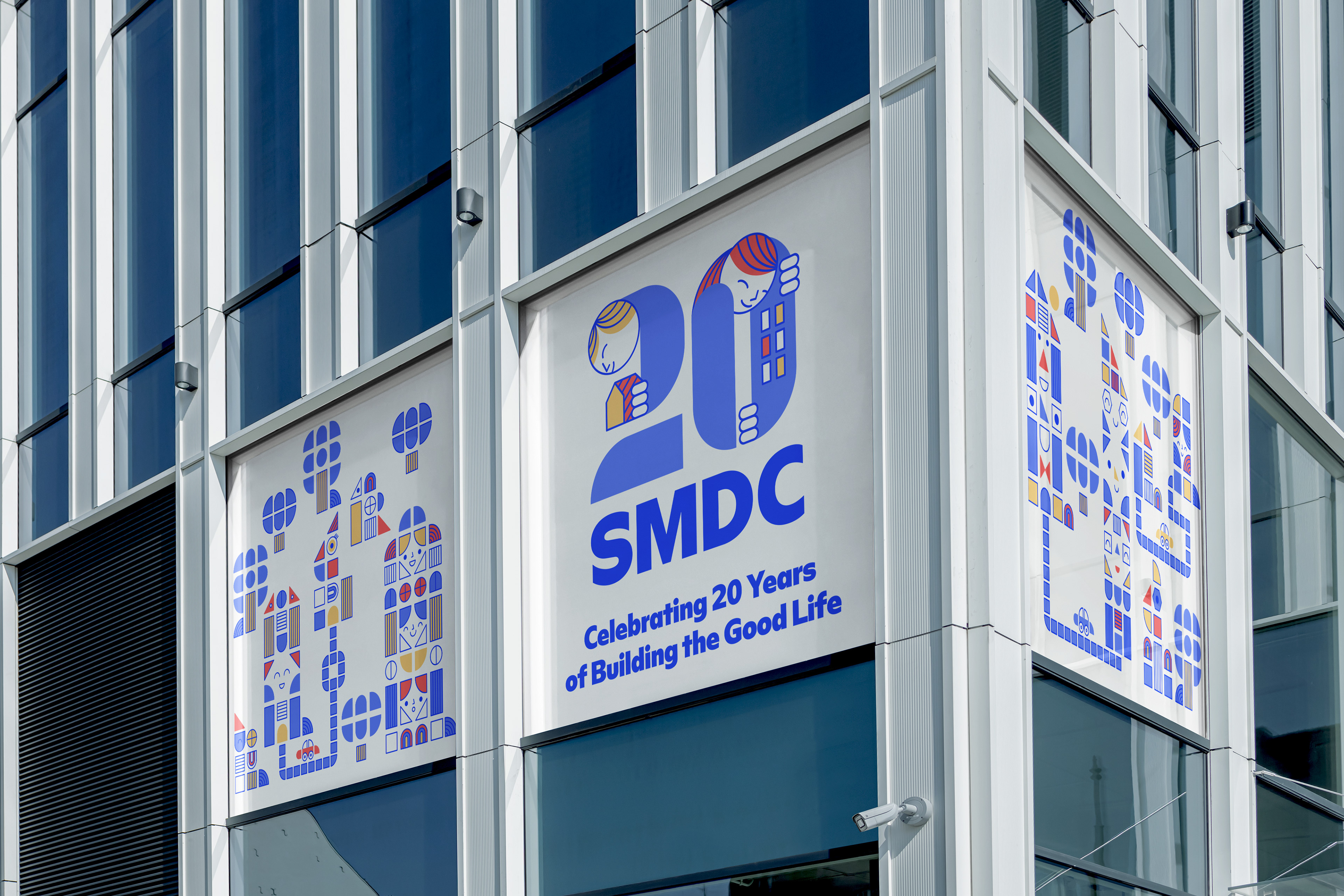
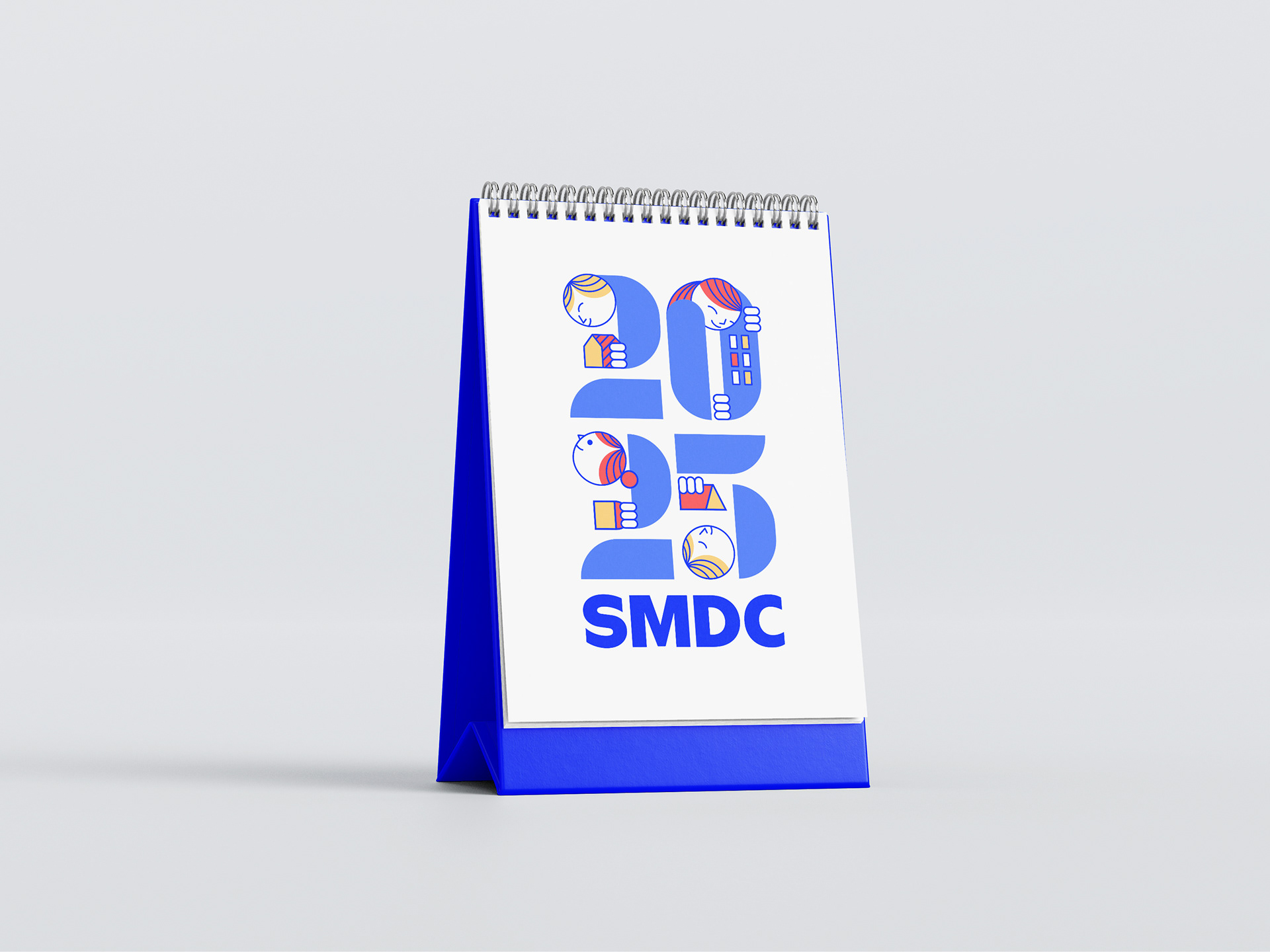
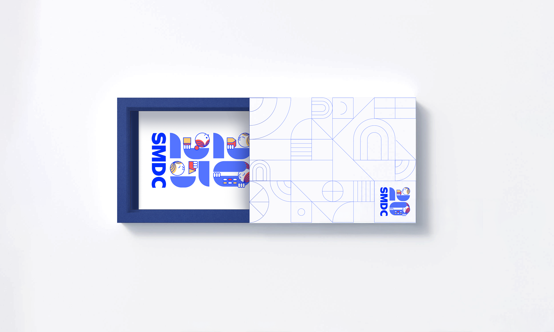
The SMDC 20th anniversary logo and key visual celebrate the company’s journey of building homes and vibrant communities. The playful design integrates building blocks and human figures, symbolizing SMDC’s commitment to affordable housing, community-building, and innovation.
Logo Design
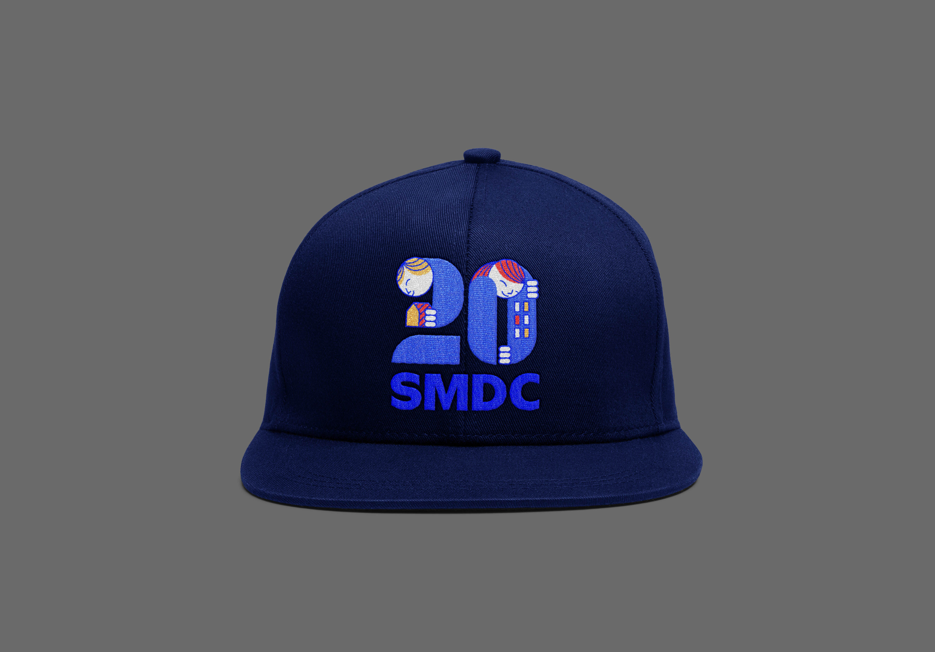
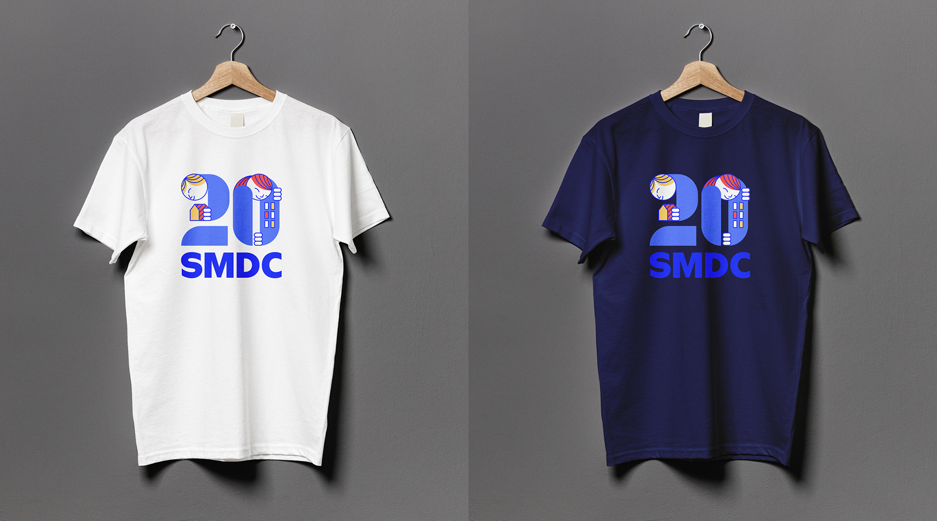
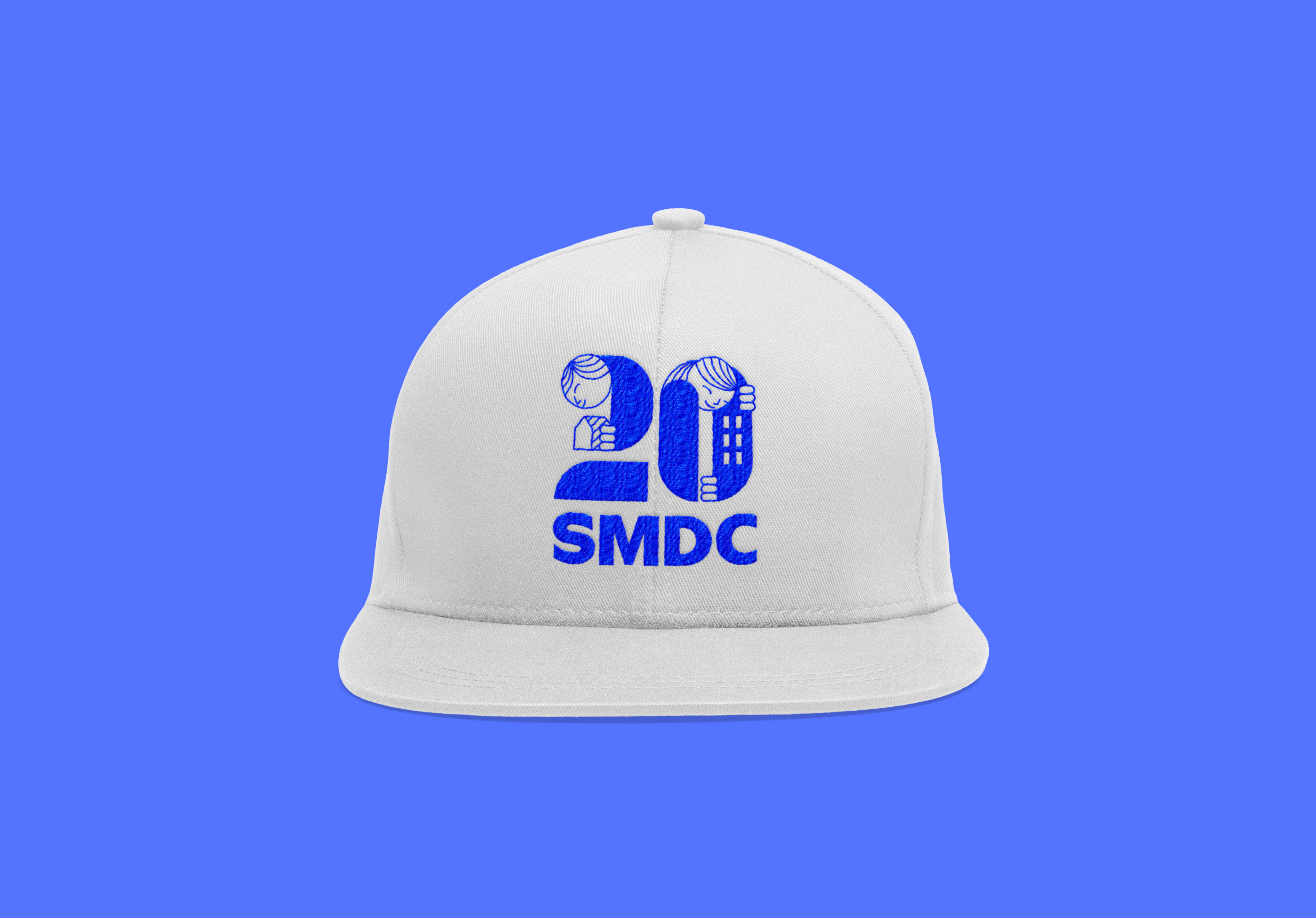
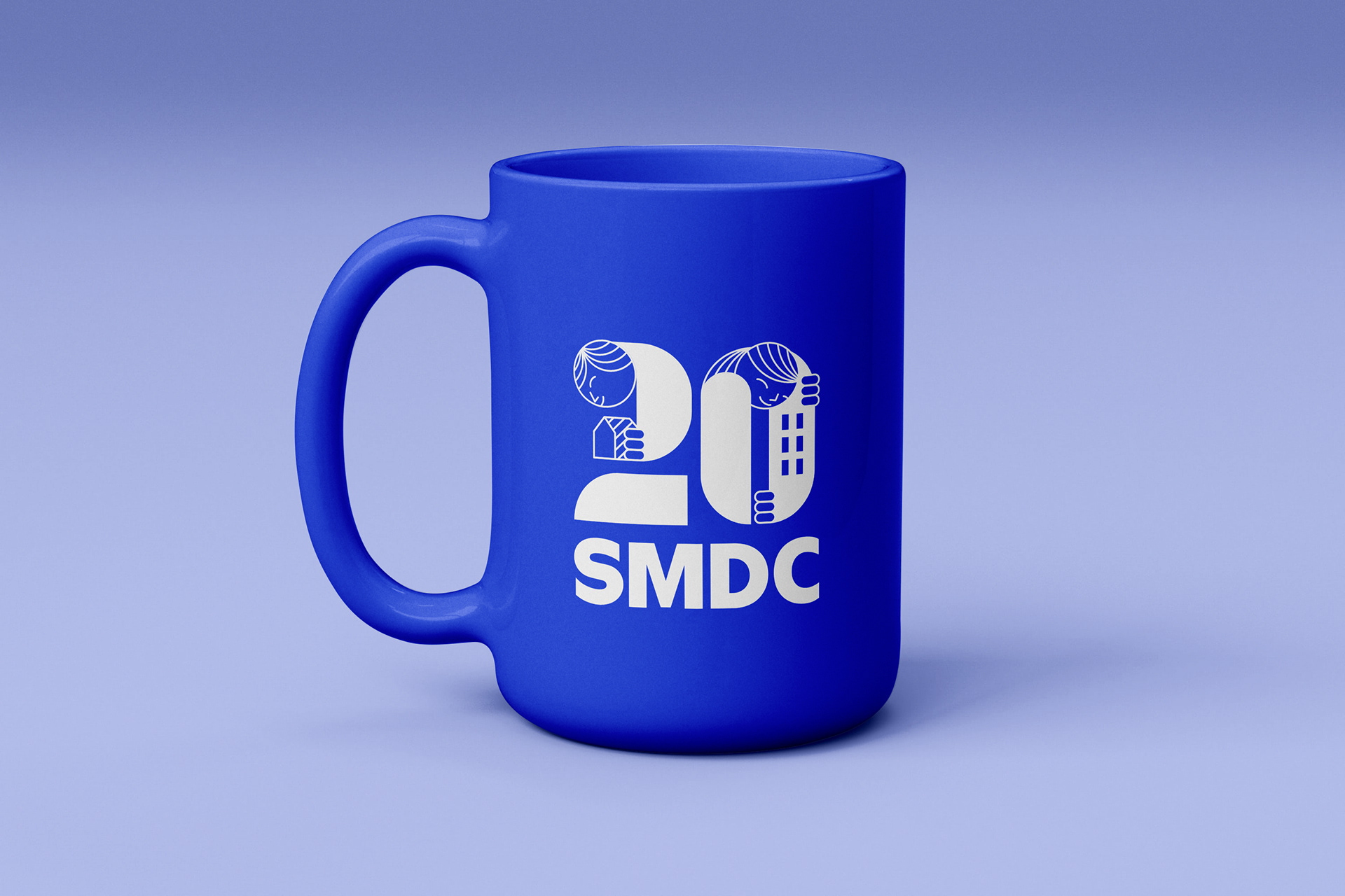
The number "20" features human figures, with a playful, modern style that represents SMDC’s innovative approach to real estate, focusing on home, community, and sustainability..
Human Figures: The "2" shows a figure holding a house, representing SMDC’s focus on providing homes. The "0" features a figure embracing a building, symbolizing community development.
Color Scheme: Dominated by electric blue for energy and brand alignment, with yellow and red-orange accents for a youthful, vibrant feel.Typography: Bold SMDC text in electric blue reinforces the brand identity.
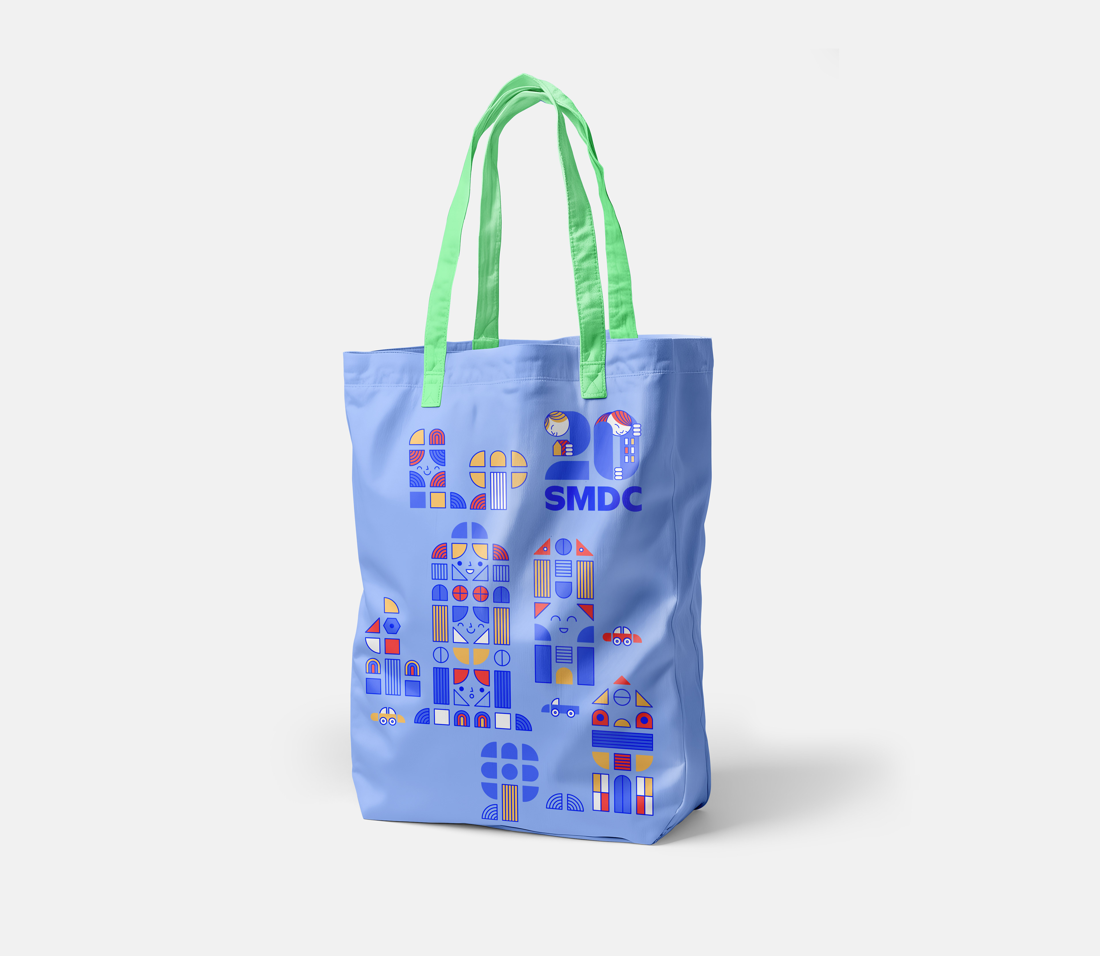
Key Visual
The key visual is a vibrant, playful illustration featuring geometric building blocks and faces integrated into the design, symbolizing the homes and communities that SMDC has created over the years.
Building Blocks: Modular shapes represent SMDC’s diverse properties, highlighting creativity and expertise in real estate.
Human Faces: Smiling faces within the buildings symbolize the people and communities thriving within SMDC’s developments.
Color Palette: Electric blue, paired with yellow and orange, emphasizes trust, optimism, and a welcoming atmosphere.
Aesthetic: The fun, contemporary design reflects SMDC’s innovative and forward-thinking approach, showing properties as lively and filled with community spirit.
Overall, the visuals embody SMDC’s dedication to creating lasting homes and thriving communities, marking 20 years of growth and future aspirations.
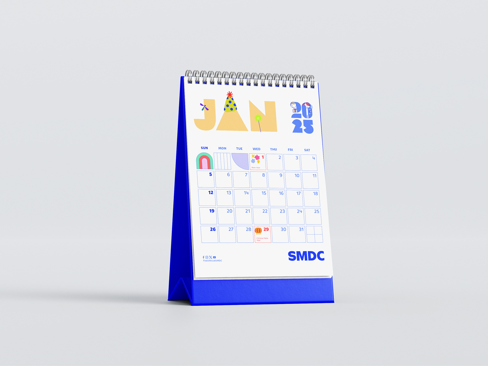
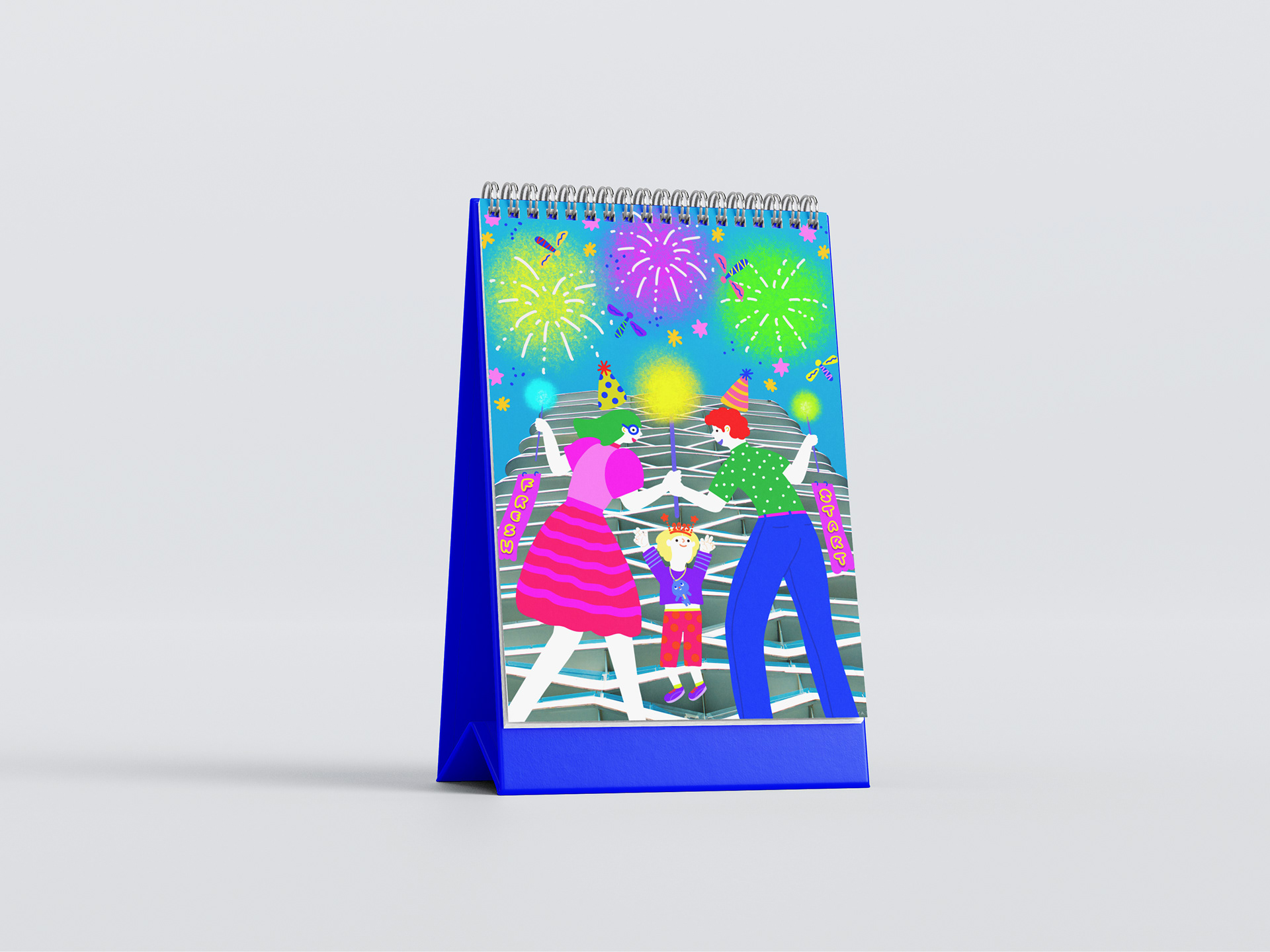
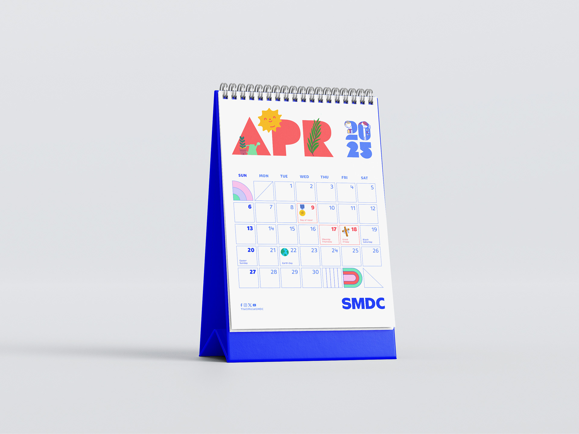
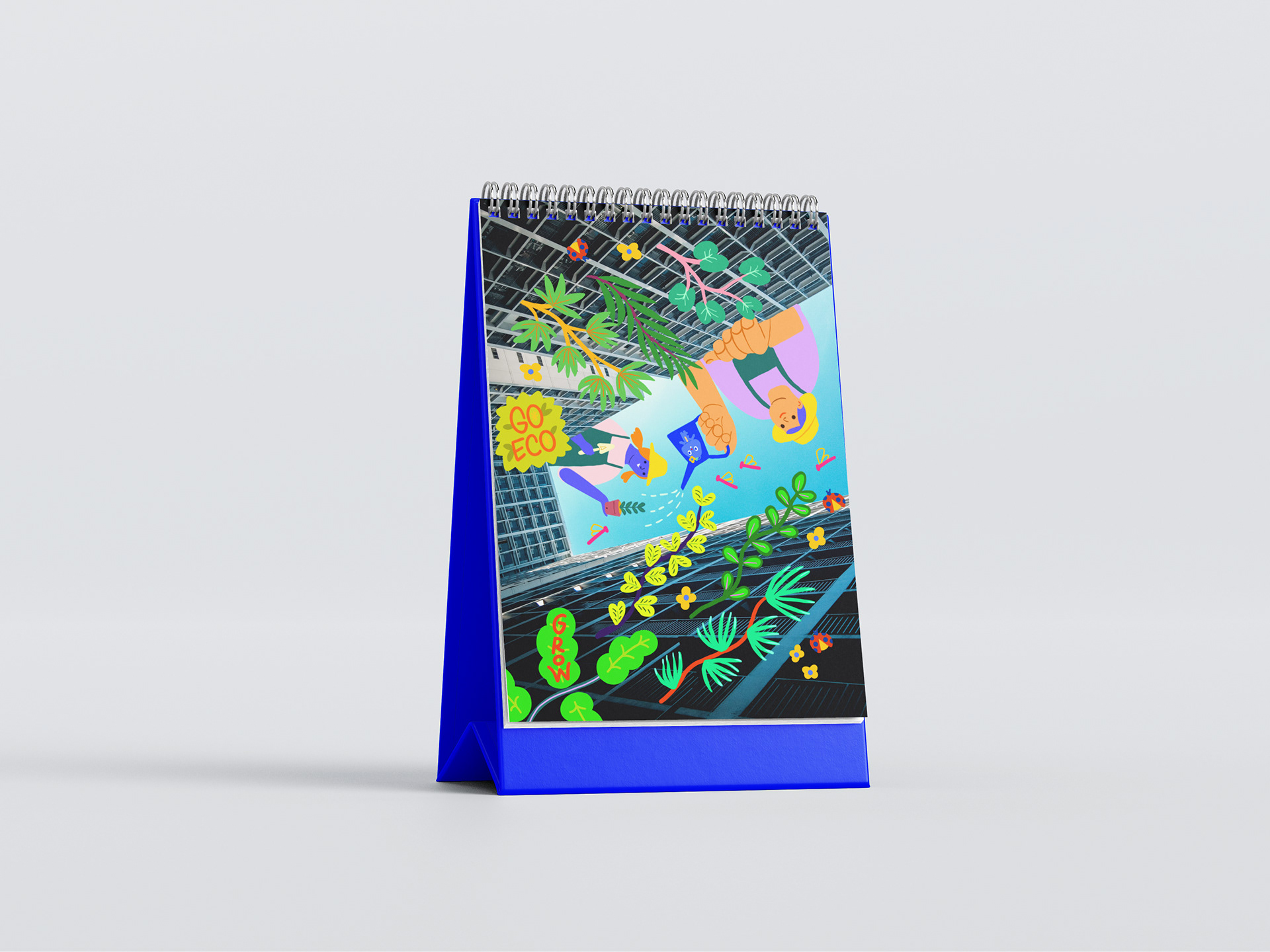
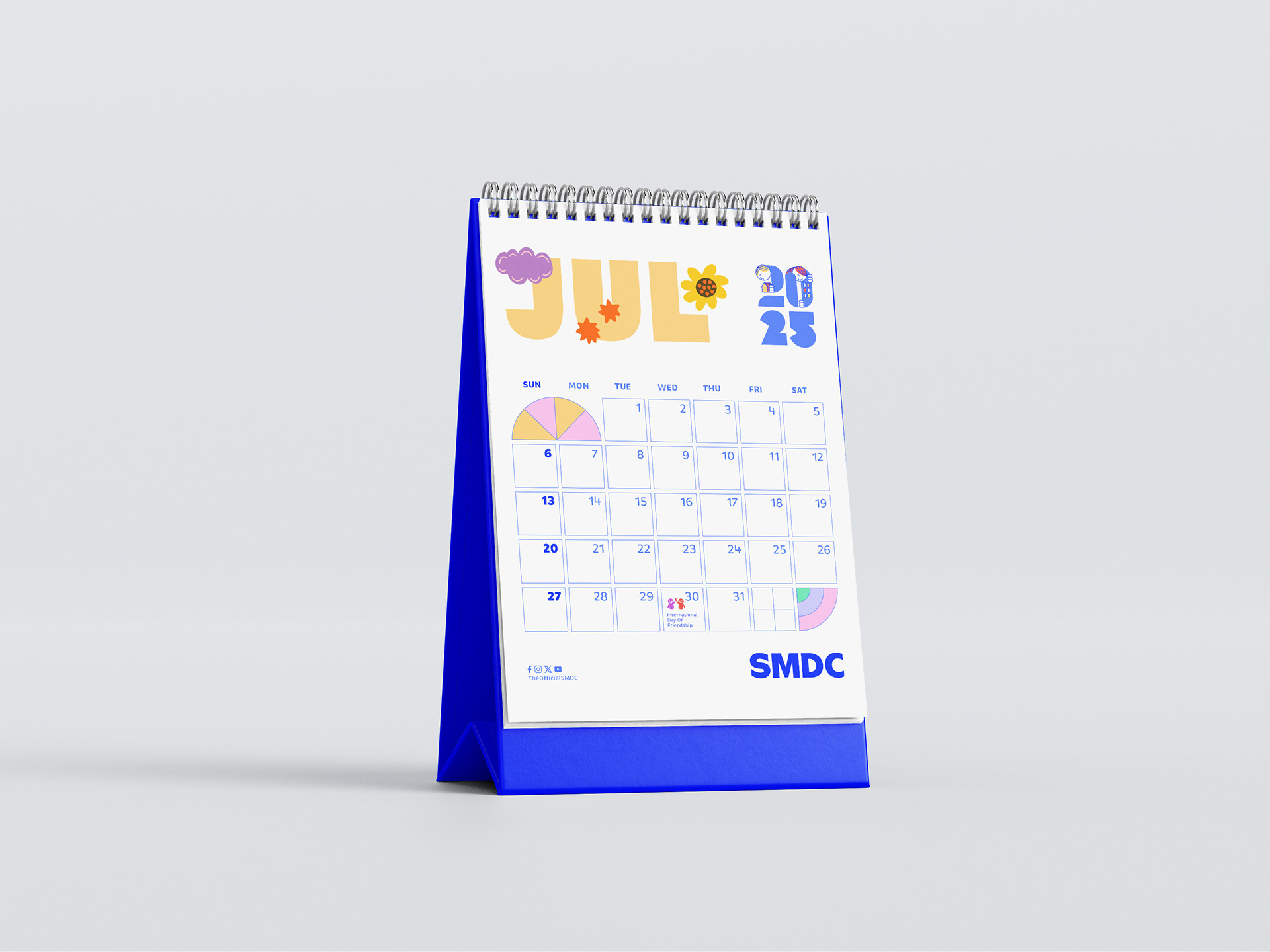
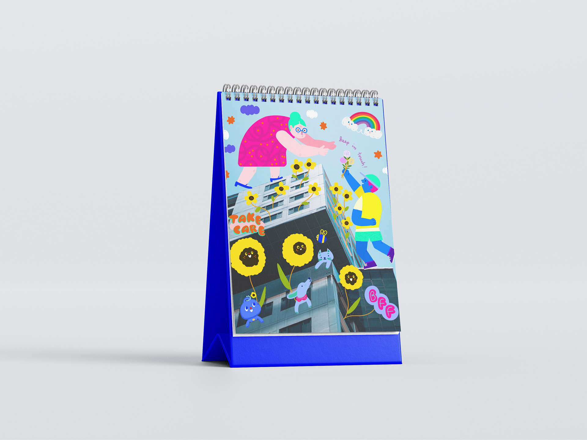
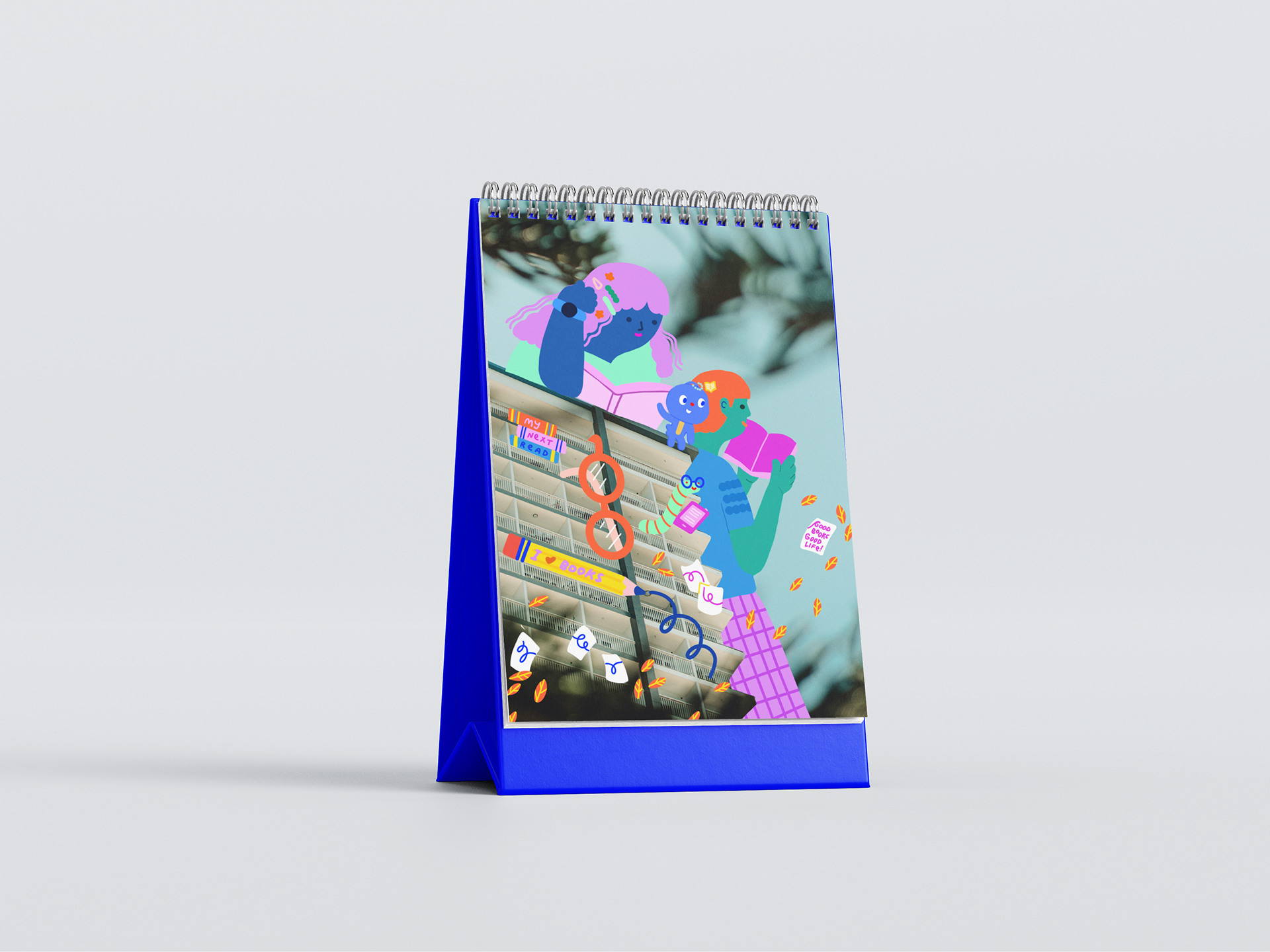
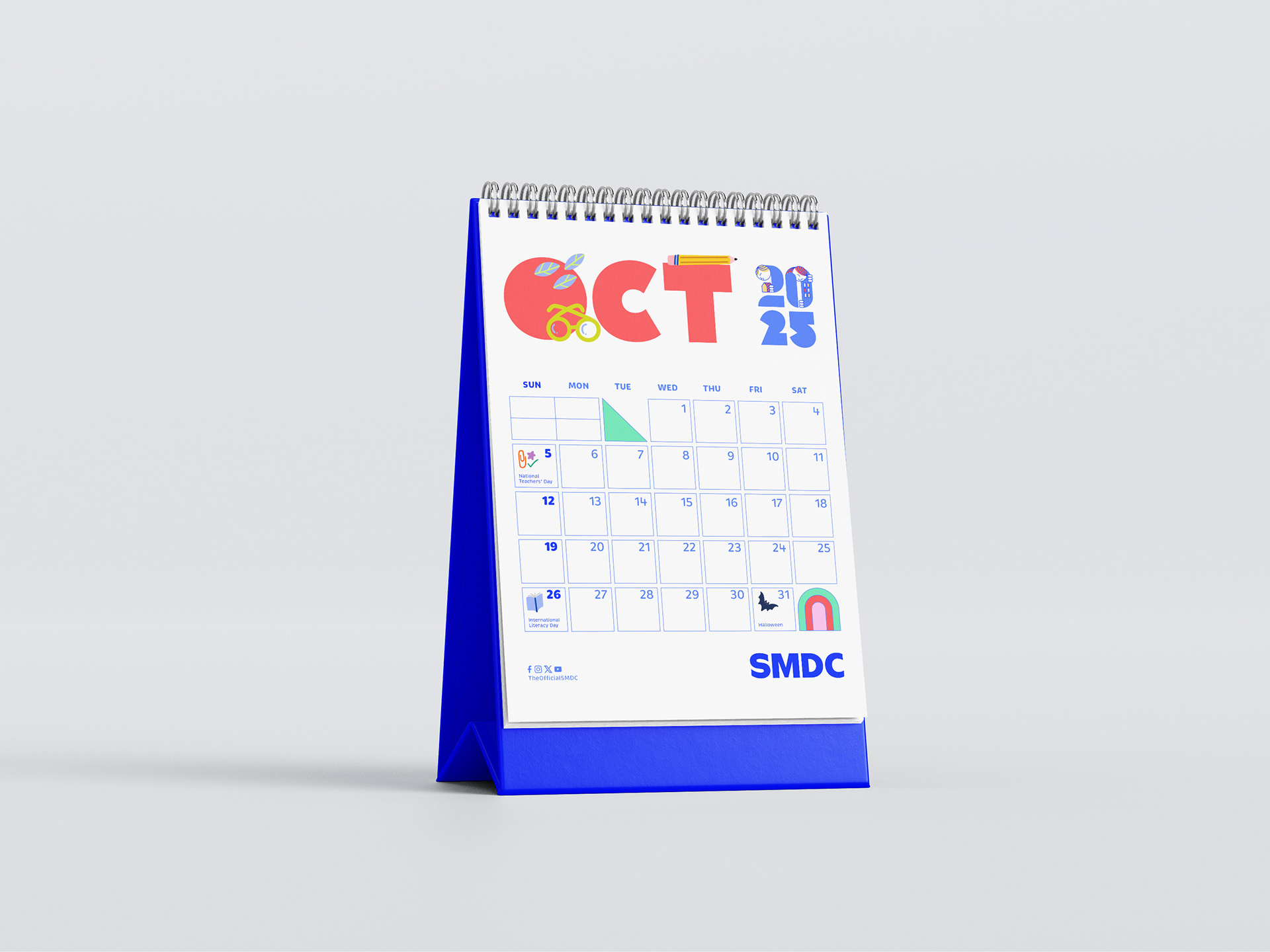
Desk Calendar
Mascot


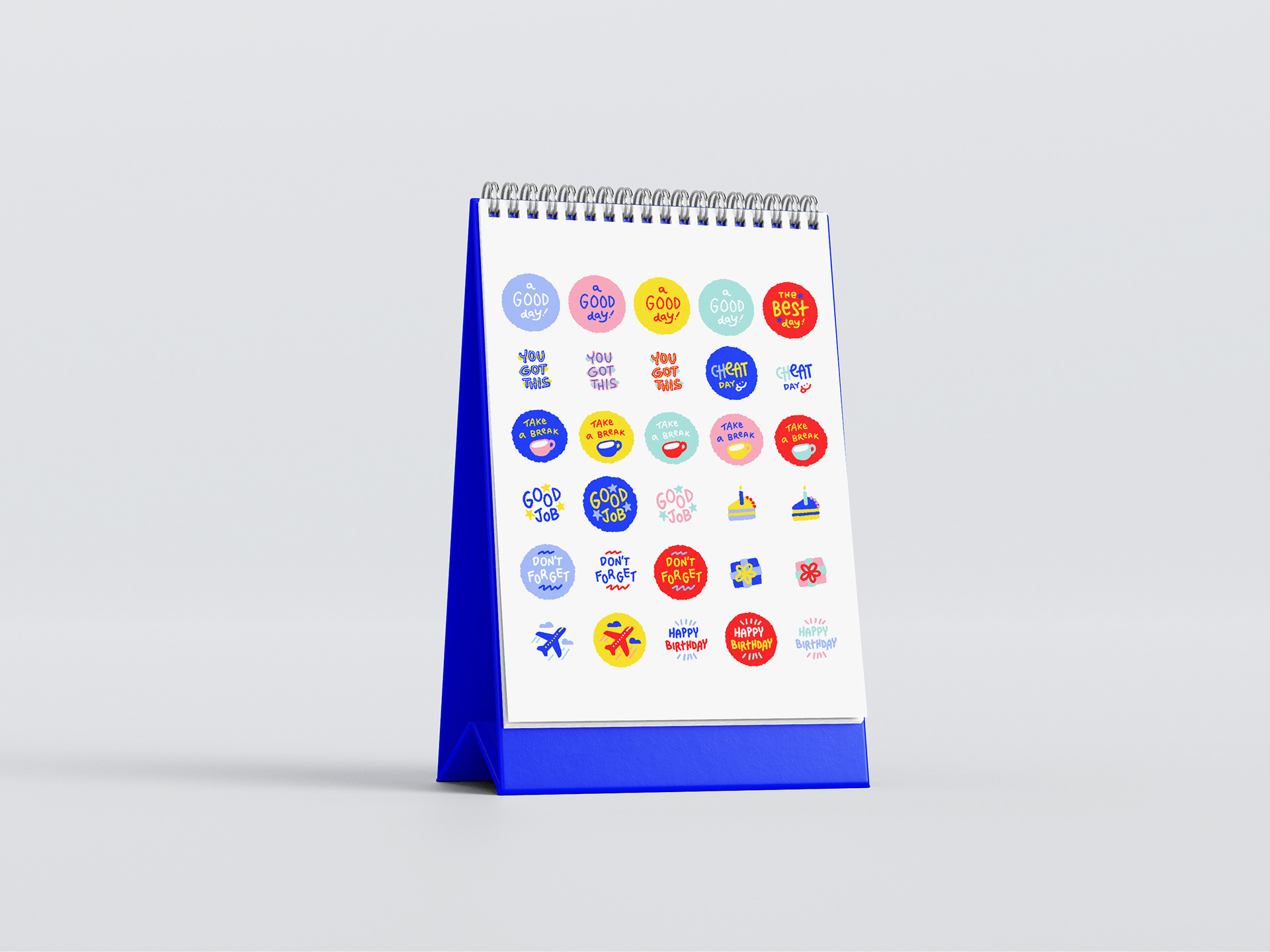
Merch