UNICON is a supplementary business of JG Summit Holdings, Inc.
(JGSHI). UNICON approached Studio Dialogo to help redesign their company logo and collaterals.
(JGSHI). UNICON approached Studio Dialogo to help redesign their company logo and collaterals.
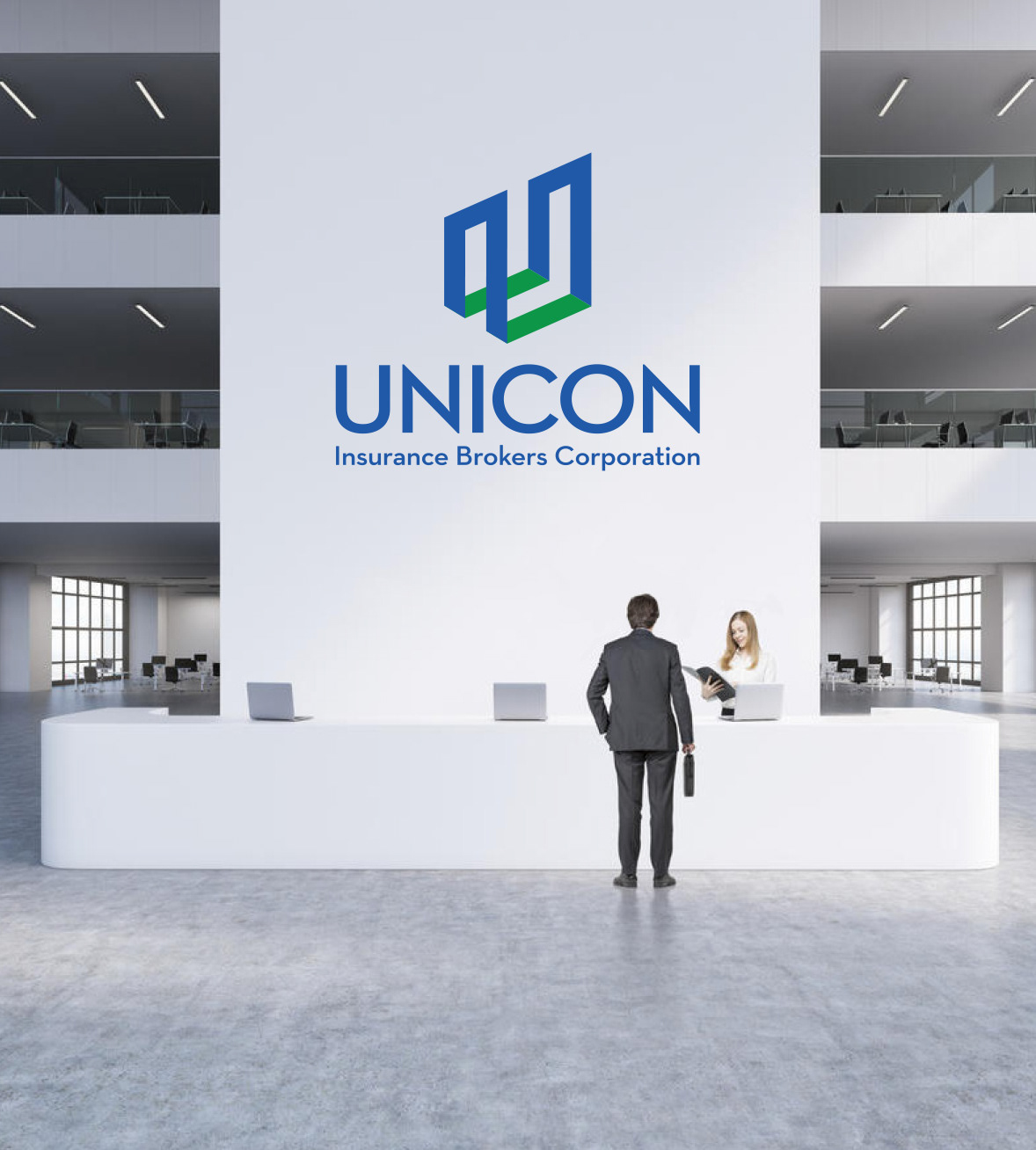
The UNICON logo has two main parts:
The LOGO MARK is an infinity symbol, rendered as a letter “U.” It echoes the shapes and colors of its mother company, JG Summit Holdings, Inc. As with a bar graph, the horizontal lines of the “U” shows growth. When rendered in one-color, the direction of the “U” shifts and moves. This symbolizes the dynamic nature of the company.
The LOGO TYPE has three parts:
• “UNICON”
• “Insurance Brokers Corporation” and,
• “A JG Summit Company”
• “UNICON”
• “Insurance Brokers Corporation” and,
• “A JG Summit Company”
“UNICON” and “Insurance Brokers Corporation” uses Neutra Text Demi, a geometric, modern sans serif typeface conceived as a display and headline type. Its clean lines and sharp points complement the “U.” It depicts order, stability and credibility. At the same time, the bowls and counters of the typeface are round, with soft, even curves. This depicts the company’s commitment to quality customer service.
“A JG Summit Company.” is set in Optima Italics.


